William Steiger: Thrills (by Robert C. Morgan)
Having reviewed and written about William Steiger's work during an earlier stage of his career, I am taken by the fact that his subject matter and his point of view appear to uphold a consistency. I am not entirely certain as to what this means by today's standards, but it seems to imply the artist's ability to sustain a certain ethos, meaning that he returns again and again to explore and investigate both the visual and conceptual terms that carry these dated architectural and playland entertainment phenomena into the age of the Internet. Therefore, the transition between the Post-Industrial and the Informational Age appears all the more pronounced, if not, deftly poignant in articulating a shift in our consciousness through a painterly means of arbitration.
I go to Hilla and Bernd Bechers' photography to suggest what I believe offers a curious comparison. In the work of the Bechers, there is a similar means of arbitration, poised in a slightly different way, where the precision of their photographs, consistently employs an overcast sky to avoid shadowing, and a horizon taken at midpoint (using a cheery picker) between the ground and full height of the Cooling Towers or the Gas Tanks. Often these icons of industry in the twentieth century are placed in an even grid sequence to reveal the similarity of their design. They might be understood as somewhere between documentation and sculpture, which is not unrelated to the work of Steiger.
Still, I would argue, Steiger avoids extreme forms of documentation in favor of another way of working, namely, through a reductive abstract means of decodification. Here one bears witness to paintings, such as New York I (Digger's New Yorker) and a three-quarter, backwards view of the sign for Silvercup Studios, both oil on linen paintings from 2016. As with the Bechers, Steiger employs precision in every aspect of his work, but instead of repeating the motif in a grid format, we are shown single examples of these block-formed and/or linear structures. There may be variations on a theme, as for example in Digger's New York in which he uses a smaller format with various collage elements. These works are shown in separate frames. In recent years, the artist has become more involved with collage techniques that include gouache, glue, and found papers. The precision is maintained in the collages as they carry their own visual affect in terms of the directness by which the structural subject matter is viewed.
What separates Steiger's paintings and collages from design? He is often confronted with this question. My readymade answer to this would be “the manner in which he uses abstraction.” Certainly one might say that there is abstraction in design, but this kind of abstraction follows different external rules than the kind of approach Steiger performs. Rather Steiger employs abstraction in the way any real painter does: to pronounce the affect of the painting and to give it feeling - not a defined feeling, but an ambiguous one. Art requires some degree of ambiguity in order to exist as art.
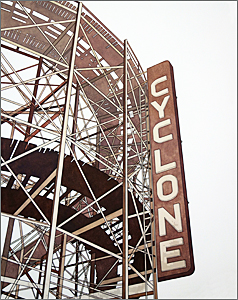
Analyzing the painted signage in the magnificent Thrills (2016) or the collage version of Cyclone Rollercoaster #2 (2016) is evidence enough to suggest that Steiger's awareness of the internal workings of abstract form are what give his work the pulse and excitement that it has. It is a kind of tour-de-force that makes us open our eyes and to re-charge the synaptic connection between the retina and the brain, and thus begin to feel the celebration in this artist's work as something truly exemplary.
Explorations and Surveys (by Dan Piepenbring)
William Steiger's collages are wonderous, often humorous refractions of early American landscapes. They traffic in a particular kind of anachronism, grafting zepplins, prop planes, gondolas, bridges, and the gleaming apparatus of the steam age onto the vast plains and prairies of the nineteenth-century frontier. The images dare us to reconcile two equally innocent visions of American life. One is taut, sleek, and brimming with technological optimism; the other is lush, free, and unspoiled. Neither, it goes without saying, have quite panned out as our forebears hoped they might.
The series, “Explorations & Surveys,” plays with our country's mythology, conflating more than a century of travel and invention into pale stories of our naïveté—everything in the world of these images is still ours for the taking. Steiger constructed the pieces using a nineteenth-century surveyors' guide. His gallery, Pace Prints, explains:
Steiger borrowed the abbreviated title, Explorations & Surveys, from the title of his source material, Reports of the Explorations and Surveys to Ascertain the Most Practicable and Economic Route for a Railroad from the Mississippi River to the Pacific Ocean. These accounts were published by the Federal Government in the late 1850s to both document the western regions and to locate the best routes for the forthcoming Pacific Railroad. Disseminated in bound editions, the volumes were essentially the first published images of the American West.
These works, and others, are on view at Pace Prints Chelsea through February 21st...
Plausible Reveries (by Matt Fisher)
In Mr. DeMarkis's sixth grade class, a few of us managed to spend lots of time doodling. Usually the subject matter included some combination of spaceships, Arnold Swarzenegger, and roller coasters. Coasters were the specialty, zooming, looping and twisting in impossible configurations, sometimes requiring rocket-enabled cars or leaps across starry chasms. Sure, we knew that the trestles and struts we improvised probably wouldn't support a real coaster's weight, but they were close enough for our needs. We were collaborating on a group fantasy, constructed with real-ish objects intended as plausible actors in an open-ended story.
I'm reminded of those drawings the more time I spend with William Steiger's paintings, which are built out of similar reveries. His work, of course, is produced with a level of focus, clarity and skill far beyond the casual doodles we were cranking out, but there is something similar in the gee-whiz adoration of mechanically complicated contraptions, and moreover in the way the paintings show more-or-less plausible objects that sometimes belie their own origin in an objective world of fact.
Take for example, 2011's Blue Wonderwheel, the latest in an ongoing series of renderings of Deno's Wonder Wheel in Coney Island, and part of Steiger's show Manufactory at Margaret Thatcher Projects. At first glance, it appears to be a competent, draftlike rendering, but on closer inspection, lines appear to cross in front of each other in wrong ways, struts entangle, the whole interior support system loses itself in a spiderweb, and the likelihood of this image corresponding to the real-world attraction breaks down. Instead, the painting becomes a kind of contradiction, either a faithful rendering of an incorrectly-remembered object, or (and this is more likely) a self-reflective and somewhat mischievous exercise in which some reveries deflect others, dreams dissolve in midstream, and objects imply both their own selfhood but also leak out into other identities.
In Steiger's world of objects, these kinds of contradictions pop up often. For example, in Cyclone III (2011) the tangle and insensibility of the coaster's struts only become evident after a beat or two. In most of his recent aerial paintings of planted fields, the machined regularity of the landscape, smoothed-over features of river arcs and banks, and artificiality of the view are enough to both imply and refute a specific locale. And in paintings of manufactories and farm buildings, the occasional impossibility of the placements of certain windows, gables, or volumes only occurs to you after a few moments.
Steiger paints several kinds of subject matter, usually in ongoing sets: funiculars, train cars, roller coasters, biplanes and zeppelins, tunnels, granaries, railway semaphores, all highly articulated forms that can withstand his rigorous reductions of detail without losing a sense of directness and concision. Steiger chooses to give enough detail, enough referent, but not a bit more. The overall effect is the concentration of emphasis on small pleasures of hue, texture, and composition that are folded into a depiction of otherwise iconic and distanced objects. These paintings reward a bit of patience, opening up to reveal warm subtleties after initial bold and graphic introductions are made.
Over the past several years he has alternated between stripping away and then adding back identifying details and features to his images, oscillating between object and scenario in a way that suggests a slowly evolving narrative anchored by specific-yet-ambiguous locales and memories. Recently, bits of background—mountain peaks, colors in the sky, objects toward the horizon—have been surfacing. Throughout, his subjects remain something more than visual signposts, yet other than realistically depicted landscapes.
Steiger is often described as a kind of neo-Precisionist—a successor to the lineage of Sheeler and Demuth 70 years on. Certainly, affinities with that school exist, but just as much with other movements. For Steiger is evidently too aware of too many things that fall outside the Precisionist program: the ongoing history of procedural abstraction, the timeless currency of sharp design, and most of all the slipperiness of memory. The persistence of his fascination anchors these paintings: both bold and subtle, these works manage to wink both at an age of technological optimism and at the romantic nostalgia attending its decline.
Steiger gets Maximum Impact from Minimalist Landscapes (by Margaret Hawkins)
Selective viewing is essential to sanity. The human brain can only process so much information at once, and those whose brains don't shuffle, edit and erase most of what they see and hear go mad. Order makes understanding possible.
On the opposite end of this spectrum of perception is painter William Steiger, the owner of an orderly eye if ever there were one, who selects only the most pleasing and succinct details from a tacky and complicated American landscape and paints those in flat color and high relief against otherwise blazingly blank backgrounds of whiteness.
Cable cars hang in mid-air, held up by the thinnest of wires. Watertowers—those lighthouses of the prairies, skyscrapers of the great plains—stand stark against blank white skies. Rollercoasters, Ferris wheels, railroad bridges, tunnels: These are Steiger's humble icons of perfection. A train caboose is reduced to an abstract pileup of geometric shapes in red, black and gray. The apparently sun-bleached walls of a grain elevator disappear in the whiteness of the background.
The effect of this minimalizing technique is almost musical, the isolated objects look the way a few notes sound when they are surrounded by silence. The white acts as a pause that allows us to “hear” the thing because Steiger has eliminated so much environmental detail. Fashioned with the same attention to precision that designers gave to the machines and buildings that inspired Steiger in the first place, each painting is a perfect invention.
Together, the body of work seems like an homage to the mathematics of engineering, with each object illuminated by a cleansing, almost blinding light and without a trace of human presence or sentiment.
Steiger's work approaches abstraction in places and there is a sense here that if a few more edges were removed, the literal meanings of these paintings would dissolve into planes of flat color. It is Steiger's genius, though, that they don't have to lose their literalness to keep our attention.
Steiger has set the ideas in his paintings in motion and then he steps back to admire his craft and to watch them work. Refreshingly, there is no sense of heated artistic ego or creative chaos here. Just the opposite—Steiger makes paintings that instill a cool sense of order.
William Steiger at Margaret Thatcher (by Melissa Kuntz)
By reducing landscape to simplified forms, New York-based William Steiger creates stark, cool paintings of often-archetypal subject matter. The 11 works (all 2004) in this show depict cable cars, grain elevators, a mill, an aerial landscape or the Coney Island Wonder Wheel—all curiously devoid of human presence. Apart from the legendary amusement park attraction, Steiger provides no reference to a particular locale, time of day or era.
The hard-edge, flat quality of his paint handling is fitting for the mostly architectural forms. Although rendered freehand, the edges are crisp and precise. Color is often more arbitrary than perceptual. In “Blue Mill” (60 by 48 inches), for example, the windows of the all-white edifice are an electric cerulean blue. Steiger's earlier paintings also depict man-made objects—a bridge, a lighthouse, an airplane or signal towers—within a nonspecific landscape, yet, unlike his new work, they do not rely heavily on negative space. In his recent pieces, the untouched gessoed ground is as much part of the image as are the precise shapes painted in oil. In “Elevator V” ( 60 by 48 inches), a row of grain elevators recedes in one-point perspective. The sides of the buildings that are in shadow are rendered in subtly varied values of dove gray; the sunlit areas remain the untouched white of the gessoed ground. Although the image reads correctly, the viewer is left to differentiate where the buildings end and the sky begins.
In a series of paintings of cable cars, ranging from 10 by 8 to 60 by 48 inches, either one or two intense red cars are suspended on cables that enter the composition at one edge and tilt downward, then off the canvas and out of sight. The background is either white gesso or blue “sky,” with no suggestion of where the cars might have originated or where they might be headed. The viewer is invited to imagine what occurs in the space outside of the canvas.
At his best, Steiger plays visual games with the viewer. “The Ride” (60 by 48 inches) is a green and ocher rendering of the Wonder Wheel. Designed by Charles Herman and constructed in 1918-20, the Ferris Wheel-like ride consists of eight stationary cars and 16 others that roll along interior tracks. At first glance, Steiger's painting appears to boast draftsmanlike accuracy, yet upon closer inspection, discrepancies are revealed. The lines delineating the wheel seem to become entangled or follow illogical paths, and the tracks appear to turn back on themselves. Here as elsewhere, Steiger revels both in verisimilitude and in pointing out the inherent artificiality of visual language.
First Impression – The Two-Color Miracle, A New Etching by William Steiger (by Peter Nesbitt)
William Steiger is a painter with a hands-on approach to printmaking. For his recent etching, “The Mill” (2004), he established strict technical limitations for himself: the full-color etching was to be printed using only two colors—vemillion and blue, from only two plates. Working closely with Kathy Kuehn and the other printers at Pace Editions, Steiger used a combination or soft-ground etching and aquatint. He established the image's basic combination with the etching, then used a stepped acquatint process to create the solid areas of color. Isolated parts of the plate were etched for different lengths of time so that when the two plates were printed on top of one another—wet ink on top of wet ink—the colors mixed to create a range of seductive hues, including bright red, orange, various shades of brown, near black, and tones between royal blue and violet.
The technical facts are simple—two colors, two plates—and complement the austerity of the architectural subject: a structure that, in its clarity of form, has a Shaker-like presence. Steiger deliberately left out details in order to emphasize the images's formal qualities. The right edge of the main building, for example, is implied by the relationships between shapes and colors and exists only in the mind of the viewer. It is this penchant for abstraction and sense of color, combined with matter-of-fact technique and subject that lends this print an unexpected magic.
Weekend: Fine Arts (by Ken Johnson)
William Steiger, "Signal" Margaret Thatcher Projects, 511 West 25th Street, 212-675-0222 (through Nov. 16th). Updating the Precisionism of Modernists like Charles Sheeler and Charles Demuth, Mr. Steiger creates flattened, hard-edged, high contrast paintings of grain elevators, railroad signals and amusement park rides. They have a fresh material immediacy and a cool nostalgia. The complex linear webs in shades of green or orange describing Ferris wheel-type structures are especially engaging.
Follow on Facebook: William Steiger - Artist
Makma, Melissa Kuntz on William Steiger, 2023
ModCiti, Kendall Morgan on William Steiger, 2019
White Hot, Robert C. Morgan on William Steiger, 2016
The Paris Review, Dan Piepenbring on William Steiger, 2015
ARTLOG, Matt Fisher on William Steiger, 2011
White Hot, Hans Michaud on William Steiger, 2011
Exhibition images and press release:Manufactory at Margaret Thatcher Projects, NYC, 2011
White Hot, Hans Michaud on William Steiger, 2008
BBC News, William Steiger at Royal Academy Summer Exhibition, 2007
Atlanta Creative Loafing, Take Me Back—Felicia Feaster, 2006
Atlanta Creative Loafing, Point of View—Cathy Byrd, 2002
William Steiger’s Eternal Distance, essay by Maura Robinson, 2002
Destination at Holly Johnson/Dallas and Transport at Margaret Thatcher/New York, 2008
William Steiger news, April 2008
Exhibition images: Roy Boyd Gallery, Chicago, 2007
Exhibition images and press release: Margaret Thatcher Projects, October 2006
Exhibition images and review: Marcia Wood Gallery, October 2005
Exhibition images and press release: Margaret Thatcher Projects, October 2004
Exhibition images and reviews: Pentimenti Gallery, March 2003
Exhibition images and press release: Margaret Thatcher Projects, October 2002